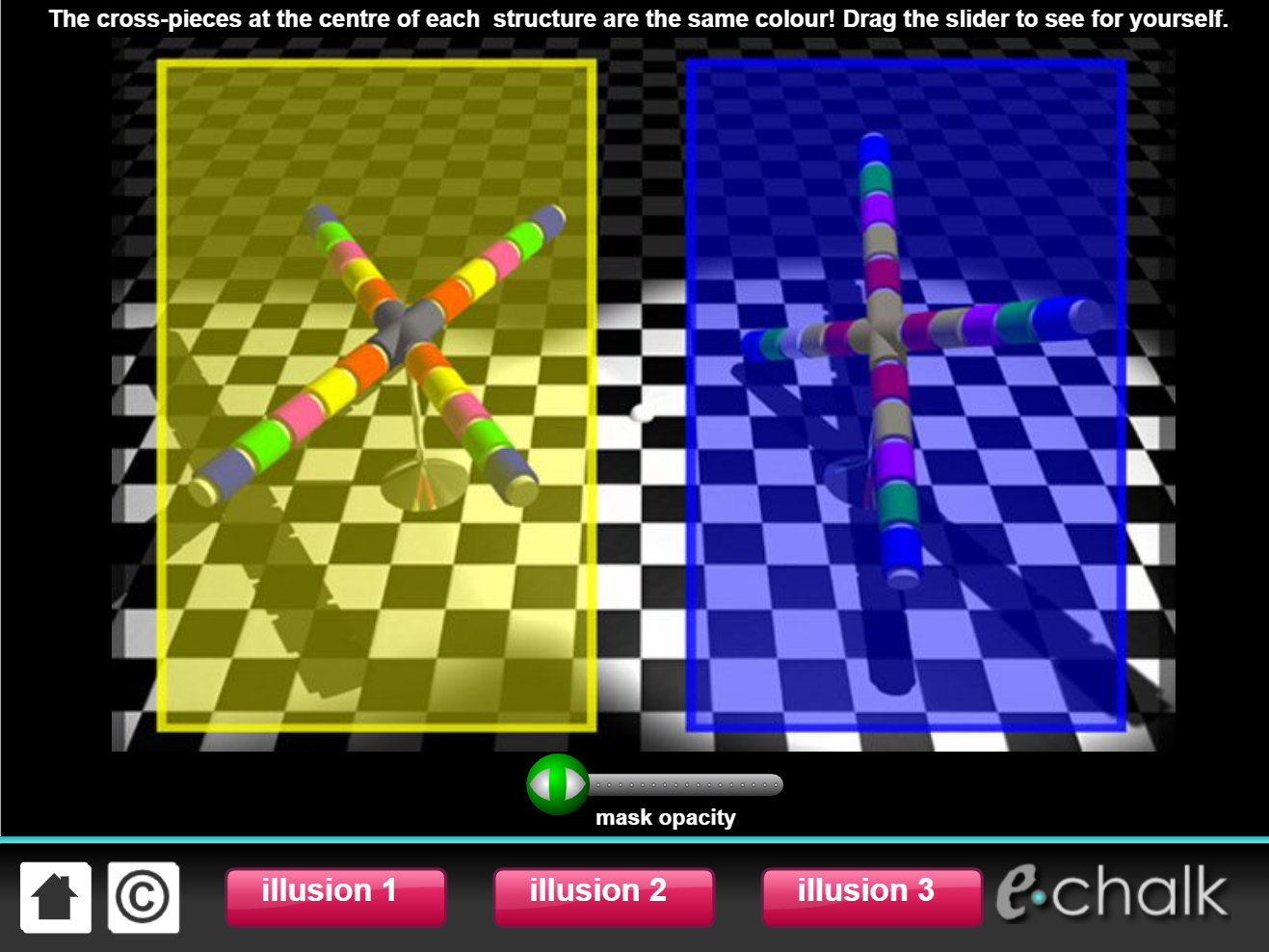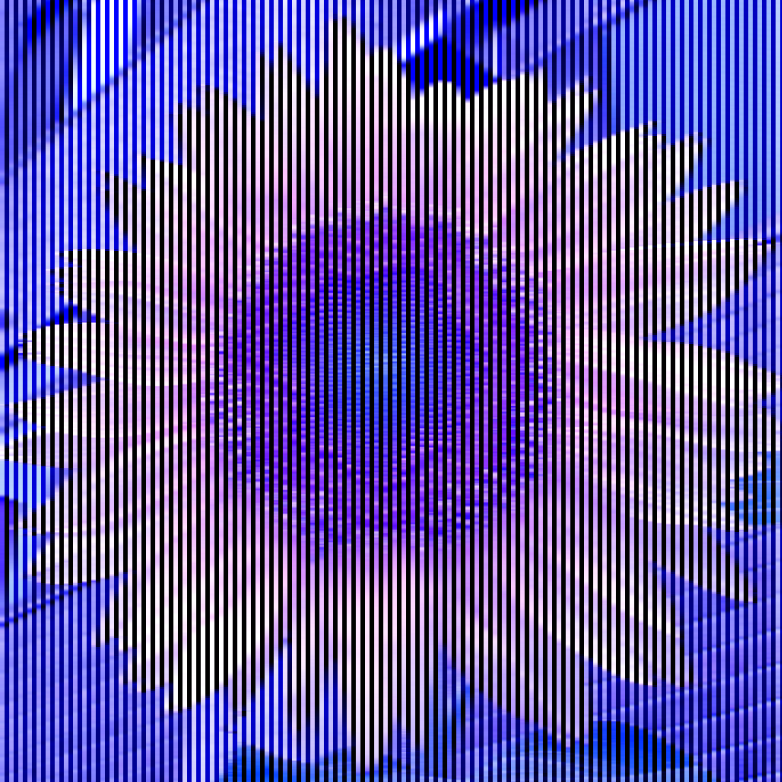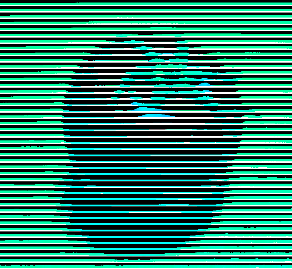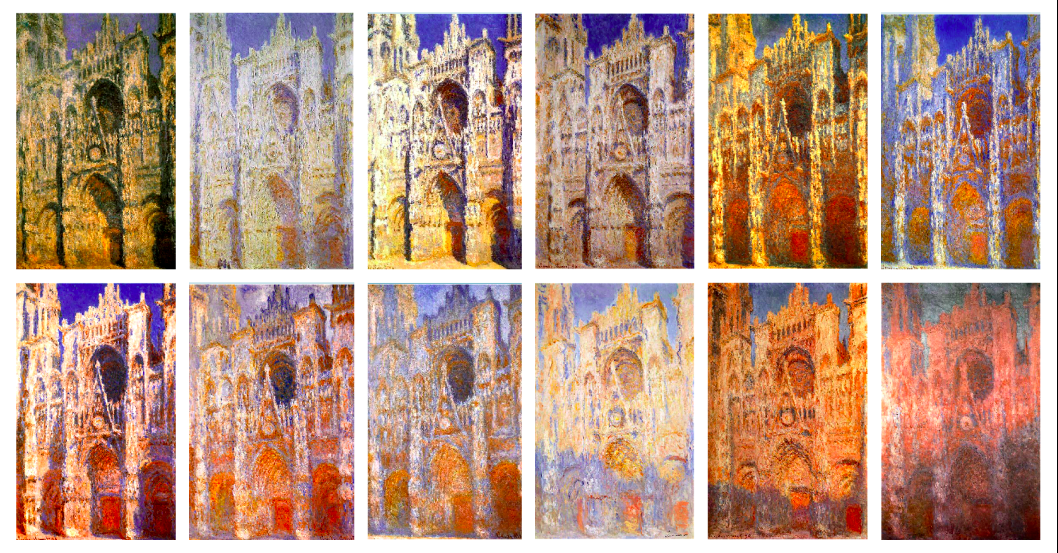
Color constancy is our brain percieving an object as the same color, even under various lighting conditions. For example, we can always tell that a lemon is yellow, whether it's under the sun, cast in shadow, or dunked in kool-aid. Our brains are able to separate the color of the objects from the color of the light.
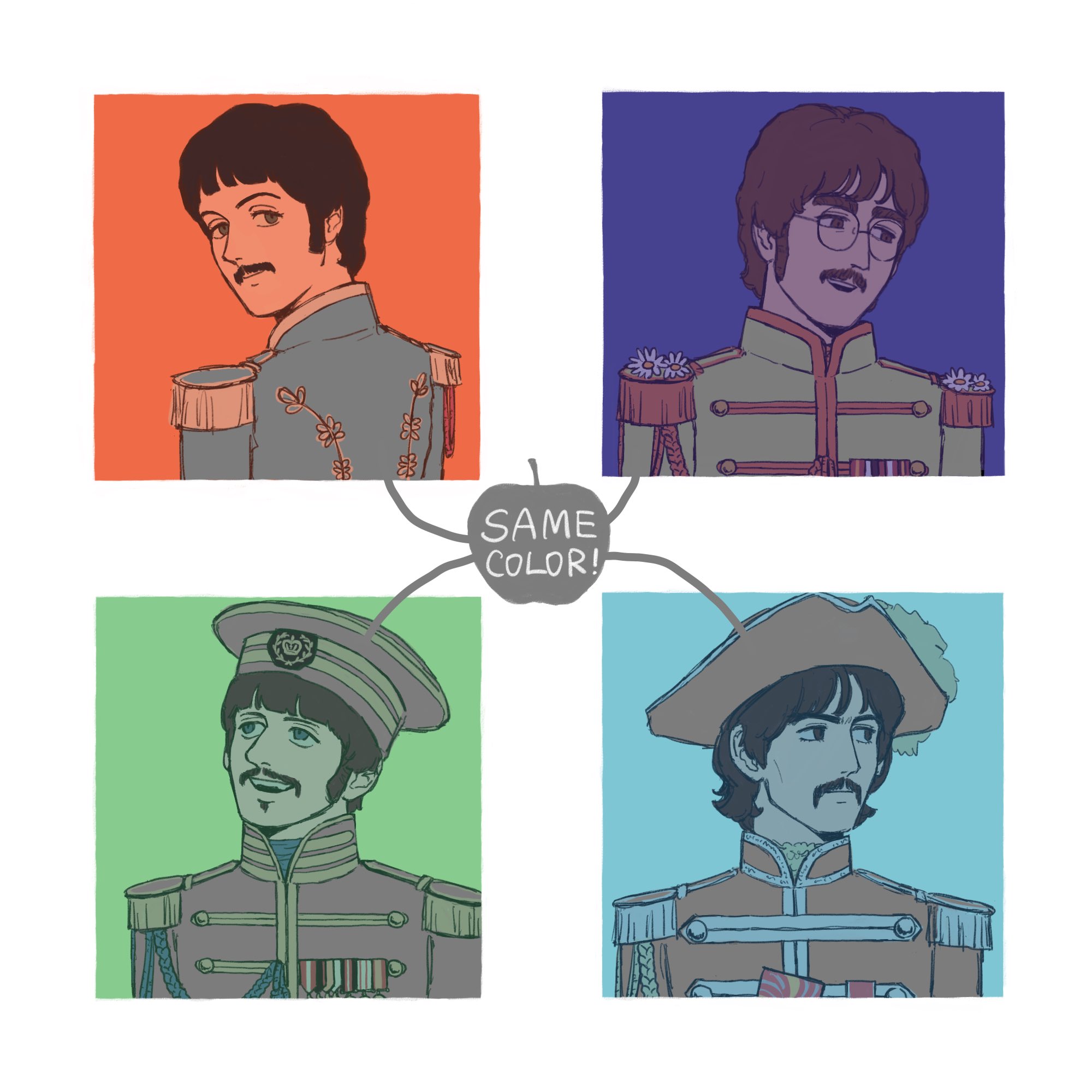
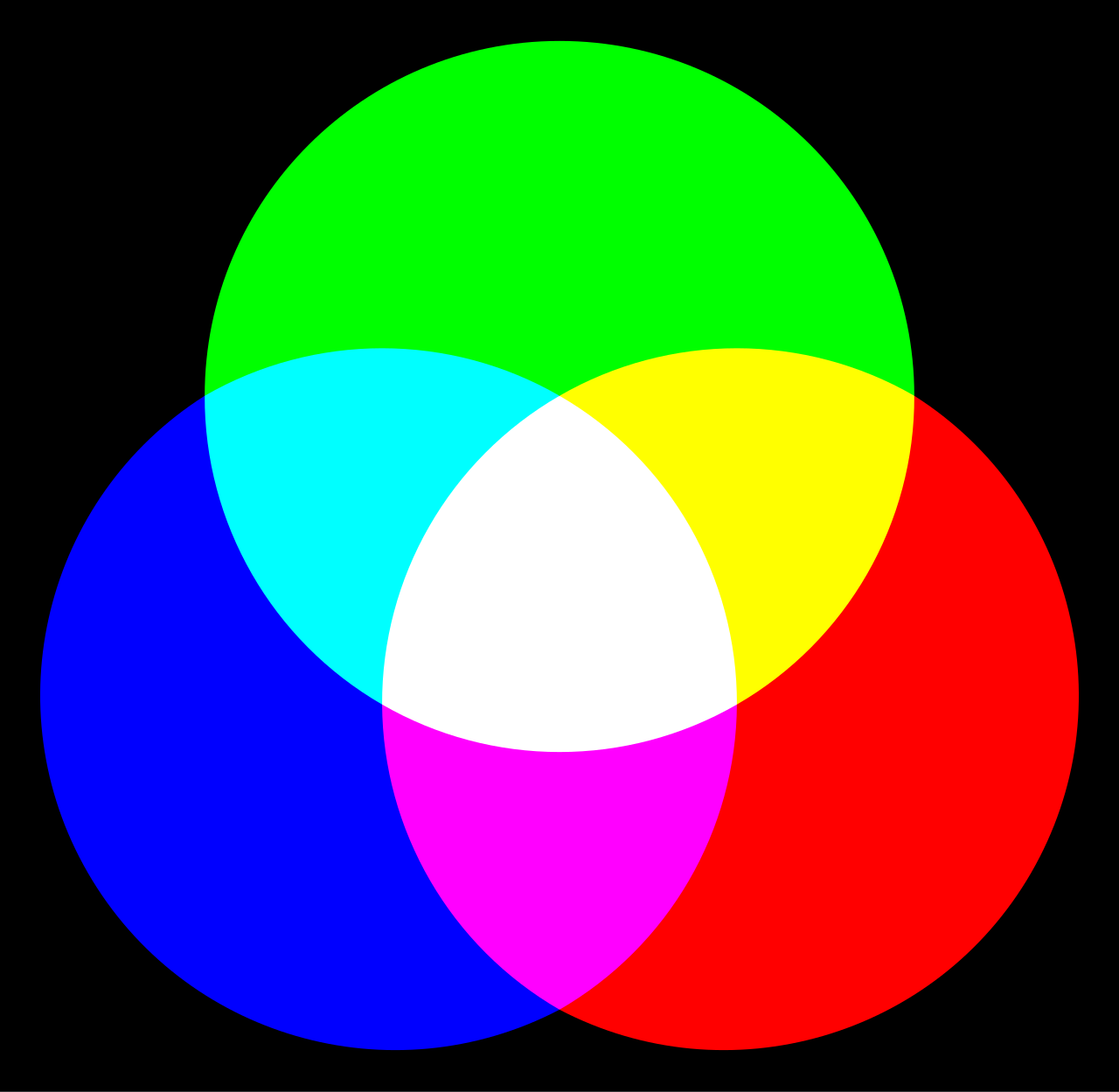
That fact is obvious, but where it gets fun is when it comes to painting! It's easy to paint a scene that takes place midday, where the subjects receive direct, white light from the sun; you just paint with the colors you see. but if you wanted to paint a bluejay during a sunset, you'd have to account for the sunset's orange tint. When the entire scene is more orange, you also have to make the blue more orange. so how do you make a BLUE more orange??? by making it GRAY! Because everything else around the bird is so orange, the technically-gray bird will appear blue in comparison. since orange is the opposite of blue on the color wheel, anything that's "un-orange" like gray will look more blue. this practice in art is called "color relativity" and it's the idea that the same color will appear different depending on the colors surrounding it. I'm so inspired by the painters who are able to master the illusion of colored light through painting.
And with the advant of digital technology, you can now color pick certain parts of photos and paintings and see what colors they really are. I love doing this as I study color theory as a digital painter. You'll be surprised by how many greens are actually just some shade of gray! or how many blues are actually green or purple in hue! Color relativity applies to anything you're painting in colored light, but the coolest examples involve using pure gray to represent a different color.